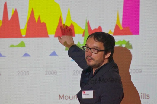
news:rewired Interactive Graphics
Key points emerging from the Interactives session:
- Interactive graphics need a clear defined purpose. Understand what the users can get out of it, and what makes it different from a static graphic.
- They take time to produce, so think in terms of updating them to keep them useful over time.
- Pick a concept that has “legs” in the first place – that won’t get old fast.
- Coders and designers are different – and you need both
- You can use human curation of information into the interactive display to add value
- Old content can be valuable in them – all the BBC’s stories around the 2012 olympics will get new value when the Games start
- Do you want users to “consume” or “interact”? Pick.
- It should be a story in its own right, not an addendum to one.
- People still mainly using [Flash](http://www.adobe.com/products/flash/flashpro/ "Adobe Flash") (despite iOS issues). Take up for [Silverlight](http://silverlight.net/ "Silverlight")-based infographics has been awful.
- If you don’t trust the data, don’t use it.
- As you do more and more, you start developing a code library that can speed up later projects.
- Useful tool: [Freebase](http://www.freebase.com/)
- Book recommendation: [The Tiger That Isn’t: Seeing Through a World of Numbers](http://www.amazon.co.uk/gp/product/1846681111?ie=UTF8&tag=fishnefedora-21&linkCode=as2&camp=1634&creative=19450&creativeASIN=1846681111)![]()
[](http://www.zemanta.com/ "Enhanced by Zemanta")


