The Lily: iterating a visual and editorial voice (News Impact Summit, Paris)
For the social media generation, the design of a story is just as important as the journalism. The Lily's Amy King explained the team's interactive approach to design at the News Impact Summit.

Liveblogged notes from Amy King’s talk at the News Impact Summit in Paris. Prone to error, inaccuracy and howling crimes against grammar. Likely to be tidied up and improved in the next 48 hours.
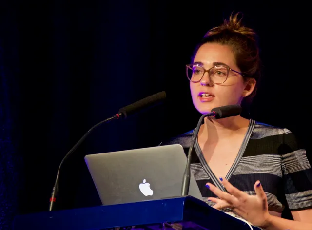
Amy King, editor-in-chief and creative director, The Lily.
The Lily is a publication from the Washington Post, but with its own website and aesthetic, targeted at women from 25 to 35. The adapt Washington Post content, the write their own and have a contract writer.
King was a print designer working on regional newspapers. Five years ago, she joined the Washington Post as an art director. She was a beneficiary of the Bezos acquisition, as part if the emerging new products. They work with Snapchat, Apple News and Flipboard.
Their working mantra is that stories and presentation are as important as each other. Visual design is a heavy focus in what they do.
Kitchen Table Lily
The Lily was born of a desire to take what they’d learnt and reach new audiences with it. It started in her kitchen, where she brainstormed some ideas that led to the Post Modern, a pitch for something that reached younger people. The feedback was that it was too broad. Back to the kitchen for some narrowing, that led to The Curse (now The Lily). And yes, that was a period allusion.
The original Lily was launched in 1849 - and was edited by four women. It fought for womens issues and rights. The new Lily was named in honour of that, because they’re trying to elevate stories critical to the lives of women. In December 2016, the team got approval and fully launched in early June 2017.
However, they started with a soft launch the January before, experimenting and iterating quickly. They quickly decided to build distinct social images for every story they published. This soft launch launched six months, and it allowed them to really hone the brand. They wanted it to be instantly recognisable in people’s feeds.
Refining a visual voice

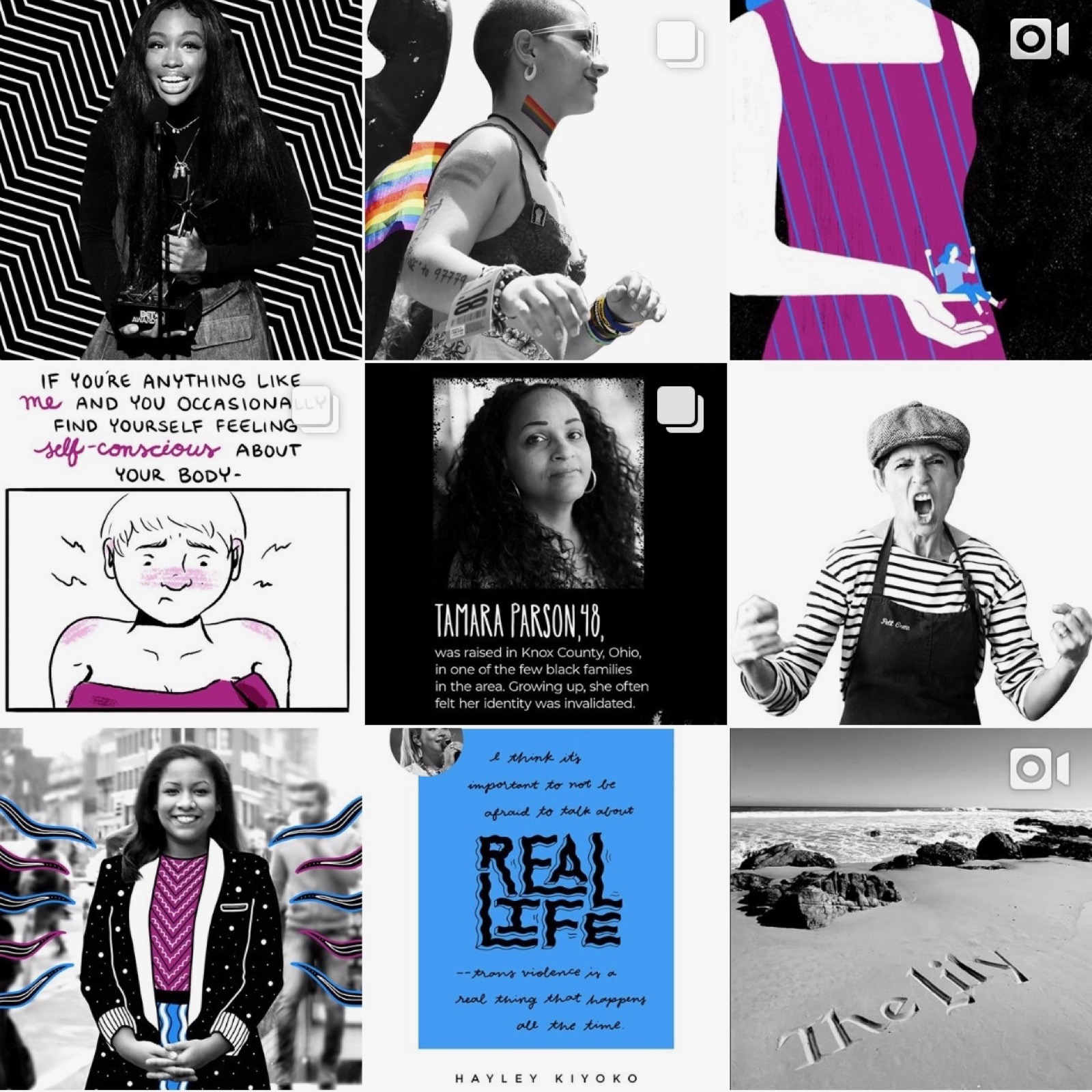
Looking at other publishers targeting the same age group, they saw a lot of bright colours. So, The Lily focused down on black, white and some focus colours. They tried blue, as the opposite of pink. They used free Google fonts and started experimenting with combinations of fonts and colour accents. They went through a gradient phase trying to differentiate wire photos.
In the end, they settled on simple, striking images. They started hand-drawing images on iPads. And they ended up with some strict rules, like black and white default for photos. Type on a photo is hand-drawn. Lines are always very thin.
They’ve worked with 173 female illustrators (and a few males, too). They get horizontal and vertical versions of the images for the different social formats. The team has have weekly design check-ins. They highlight their favourites and ones they didn’t like, allowing constant refinement of the aesthetic.
Designing an editorial voice
How about the editorial voice? They looked at what everyone else was doing - emoji, exclamation points and abbreviations - and banned them. They have a list of banned phrases - “Slay”, “dead”, “Yaaaaas”, etc.
Instagram has been their favourite platform to experiment with. Again, they found that other publications didn’t have a clear visual identity on Instagram. They have alternating what/black background for the grid.

Comics on Instagram do very well for them.
They tried to avoid quotes on photos - but they do work. They do plenty of illustrative commissions just for Instagram. They do at least one Instagram Story per working day.
All of their stories go to Apple News. Again, they create special images, which increases their chances of being featured. LilyLines, their newsletter, won a Webby award. The Monday edition is very news-led. The Thursday one is more experimental, inspired by retail chains’ emails.
They’re just starting with video - but they wanted to avoid the standard caption news video. Their solution is hand-drawn captions. And yes, they’re doing an IGTV channel.
10 Lessons from one year of The Lily
- Want to launch something new? Show people what it could look like. Involve the creative direction from the start.
- Strict design guidelines will help you stand out across platforms.
- Find one thing that is only yours - you’ll be known for it.
- Everyone on the team needs to buy in to the visual strategy.
- Instagram, Snapchat et al are very visual platforms. A creative director should be a lead part of the team.
- The voice of your Instagram should sound like the voice of your newsletter.
- Real humans do notice the effort.
- You don’t need high-tech equipment. They do most of it with iPhones.
- People want to connect with things off the internet - do events, make things people can buy. Give things away. They did a zine for the year anniversary, and sold a couple of hundred of them. They did a mural, which is still up and being Grammed six month laters.
- Offsites and field trips are really important for the team. Everyone comes with two easy ideas and two wild ideas.
Bonus: promote what you do internally. It’s great for getting help from other teams.


