Initial Thoughts on iPhone/PC Tweetdeck
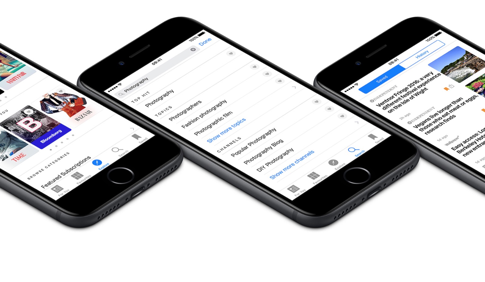
 The iPhone app? Well, it’s very iPhone. The ability to swap column works in either same way as different browser windows in mobile Safari, or in the “slide” method you use to switch between pages of apps. In some way, this makes it more easy to switch between different accounts than Tweetie (my preferred app choice up until now) does. In fact, I’d go as far as to say that this is the most iPhone-ish of the Twitter apps right now, using concepts you’re familiar with from the rest of the user interface and applying them to Twitter. I actually find it more intuitive to use than the desktop version.
And the “shake to refresh” feature is a nice, if a bit gimmicky, touch. I’m gonna be getting some strange looks on the bus…


