dConstruct 2010: discomfort, irritation and reducing
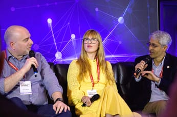
 I’m down in Brighton for dConstruct, a conference I’ve heard plenty about over the years, but never actually managed to attend. And so far, it’s proving an interesting morning. It’s certainly challenging some of the preconceived notions I see in play in the way we build websites. Brendan Dawes (right) has just given a great talk called “Boil, Simmer, Reduce”, which led on nicely from Marty Neumeier‘s talk emphasising the need to move beyond a comfort zone fo wholesale acceptance and user-testing approval to truly innovate. The first two parts of Dawes’ talk were issues I have a low-level awareness of, but easily let go of in the stress of the average day. There is a need to draw in information and inspiration from outside sources, and relect on the ideas that come from that process – and reflect again as you start drawing on those concepts while you’re working on projects.
But it was the last element – reduce – that really struck me. It was something of a call to stop just piling features on something, but to actually strip a design, a site, a concept, back to its core and provide only what’s really needed. I think there’s been a definite trend in site building in recent years to pile feature after feature onto the page, weighing it down with Javascript and PhP includes and adverts and related content. Now some of it is useful, and serves a good purpose. But does all of it? Do we need to think more clearly about what exactly the extra features are offering the user?
I’ve noted a trend in blog design in recent years, where the growth in columns from two to three is rolling back to two – or ever one. (Note the simplified look of currybet, for example) In a way, this whole thought process is pushing me back to the days of student newspapers, Macs and Pagemaker, when most magazines used every font that they possibly could. I argued for keeping the typeface choice extremely limited and, seeing as I was editor, I won. I think we’re in a similar place with web functionality right now. Roll back the widgets, concentrate on the user journey and what they really want from the site.
Sign up for e-mail updates
Join the newsletter to receive the latest posts in your inbox.


